Typography

Typography is one of the most important things to consider when creating a music magazine. The typography of the title and the font of the headlines reflects the style of music it is representing and is one of the main elements that attracts the readers' attention.


The front used for Kerrang! magazine is the main attraction for much of their target audience. As well as being associate with the rock/punk musicn genre, the typography used reflects the rebellion and the violence behind the genre with a graffiti style font and smashed glass effect.


The typography the NME magazine uses is bold capital letters. The font does not get lost within the front page as it stands out from the images. Using a bright colour and simple font would attract the students that the magazine is aimed at.


Here are some fonts I have considered using for my magazine title


Edited Photos


 I edited the 8 photos I took to make it look like they had been taken in a photo booth. I made each picture black and white and used a photo strip template to place them in a horizontal line. I framed each one so the subject was central to the picture. These will this be positioned across the double page spread to give it a personal, scrapbook effect.


The photograph that I used for my front cover was initially cropped to fit the size requirements of the cover page. I framed the image so there was space for the title of my magazine and teasers of feature articles. In addition to this, I edited the skin of the model to make it clearer. I did this by using the blur tool on Photoshop, to give the image a more professional feel. I also made the background brighter and clearer to ensure focus remained on the musician pictured.


While editing this photograph, I maintained the rule of thirds used by ensuring the model was kept to the right hand side however, cropped the image, getting rid of unnecessary blank space. In addition to this I used iPhoto's 'straighten' tool and the 'retouch' tool to remove blemishes and make the model's skin appear clearer.


Originally, I planned to change this photograph to black and white and place it in a photo-strip. I then decided that enhancing the colour of the image would pull the audience focus to the model's hair colour, and turning the image black and white would withdraw their attention from the feature. Therefore, I used iPhoto to enhance the colouring of the photograph to make the colour of her hair appear brighter. I applied this technique to the similar photographs that were then used in the double page spread article.

Possible Photos for music magazine


I chose this as the cover photo for my magazine, as although the model does not use a direct mode of address, she is facing the camera and smiling, inviting the audience in as she seems like a good person to read about.

____________________________________________________________________________

I chose this as a possible photo to be used in the double page spread. This was because the picture shows the model laughing and gives an insight into a personality.

____________________________________________________________________________


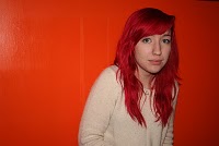
I decided not to use the picture on the left for the front cover of my music magazine as the orange background does not sit well against the artist's bright hair. However, I did chose the left image to feature in my contents page as in the right photograph, the model does not look ready for the photo to be taken. I thought using one of the images with an orange background would catch the readers eye on the contents page, making them want to turn to the double page spread article.

____________________________________________________________________________


I decided to discard these pictures as the artist is sitting akwardly and not holding the guitar in a natural way. In addition, the walls in the background cannot be seen clearly as the lighting is too dark and the banister of the stairs obstructs the image.

____________________________________________________________________________


I decided to use these pictures in a photo strip form, to make it seem like they had been taken in a photo booth. I chose pictures with the same or similar framing to create this effect. I will then edit and place the pictures in a photo strip template for a scrapbook effect on my double page spread. I chose for the model to make silly, immature faces in the pictures as they can show different aspects of the artist's personality allowing her to develop her character.

____________________________________________________________________________


I chose these three images as potential photographs to include in my double page spread. They show the musician smiling and posing for the photograph and in two of them holding a cup of tea. This made her seem more down to earth and therefore could be someone that the audience could relate to.


____________________________________________________________________________


I decided this photograph could also be considered for use in my double page spread as the model's pose could be seen as comedic as it is almost childlike. This would fit with the light-hearted tone of the article and interview.


____________________________________________________________________________


These four images are the photographs I chose to discard as in some the subject does not seem ready for the photograph to be taken and is sitting in an awkward position. Also, the images are not framed very well and in the two photographs to the right, she is too close to the bottom of the picture, leaving a lot of unnecessary empty space towards the top of the image. Moreover, some of the pictures show glare on the wall from the lighting which affect the aesthetics of the image.


Photo shoots


The first location I chose to photograph my subject in was against a white background, an orange background, and a wall decorated with 'mod' symbols. I chose the white wall to use a a background as it had glass bricks in it as decoration and enhanced the colour of the model's hair which was the main focus point. The orange background was bright and eye catching, which I felt would catch my target audience's eye. The 'mod' style background I used, I felt would appeal to the musical audience as they may listen to music from the 60's.


For second photo shoot I conducted, I positioned the model in front of a plain background, giving the impression she was in a photo-booth. I took every shot from the same angle and height to ensure the photographs looked like they had been taken in a photo-booth and I planned on editing them into a photo-strip to use in the double page spread.

Music Magazine Questionnaire

Focus Group


I asked my focus group which of these three flat plans I have created, they like best and would think suitable for my music magazine.


They agreed that the third flat plan was most suitable and would appeal to my target audience.

Brand Profile for music magazine

'Sway' magazine has become a reliable and well known brand with the it's target audience. It is recognised widely and publicised via twitter.com/swaymag, facebook.com/swaymusic and Sway Radio station. Weekly, the magazine provides readers with the most exciting and reliable music news, with festival, album and artist reviews of the best alternative and indie music and exclusive photography and posters.

Audience Profile


The audience of Why We Listen magazine are affluent young men and women, who spend their time in coffee shops and at Camden Town market, wearing Doctor Martens, skinny jeans and baggy, vintage, 'grandad' jumpers. They enjoy mostly alternative, indie music but appreciate all genres, attending festivals such as V Festival and for those who are under 18, the Underage Festival in London. Why We Listen allows advertisers to contact it's target audience to connect with optimum customers for their product, as Why We Listen is a reliable brand to the Indie teenagers, they trust what is advertised on it's pages.

Music Magazine Photos

Imogen Heap at V Festival


Taylor Swift at V Festival


Lily Allen

Music Magazine Analysis


View more presentations from megkelly.