

I edited the 8 photos I took to make it look like they had been taken in a photo booth. I made each picture black and white and used a photo strip template to place them in a horizontal line. I framed each one so the subject was central to the picture. These will this be positioned across the double page spread to give it a personal, scrapbook effect.

The photograph that I used for my front cover was initially cropped to fit the size requirements of the cover page. I framed the image so there was space for the title of my magazine and teasers of feature articles. In addition to this, I edited the skin of the model to make it clearer. I did this by using the blur tool on Photoshop, to give the image a more professional feel. I also made the background brighter and clearer to ensure focus remained on the musician pictured.


While editing this photograph, I maintained the rule of thirds used by ensuring the model was kept to the right hand side however, cropped the image, getting rid of unnecessary blank space. In addition to this I used iPhoto's 'straighten' tool and the 'retouch' tool to remove blemishes and make the model's skin appear clearer.


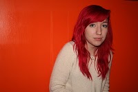
Originally, I planned to change this photograph to black and white and place it in a photo-strip. I then decided that enhancing the colour of the image would pull the audience focus to the model's hair colour, and turning the image black and white would withdraw their attention from the feature. Therefore, I used iPhoto to enhance the colouring of the photograph to make the colour of her hair appear brighter. I applied this technique to the similar photographs that were then used in the double page spread article.


 I edited the 8 photos I took to make it look like they had been taken in a photo booth. I made each picture black and white and used a photo strip template to place them in a horizontal line. I framed each one so the subject was central to the picture. These will this be positioned across the double page spread to give it a personal, scrapbook effect.

 While editing this photograph, I maintained the rule of thirds used by ensuring the model was kept to the right hand side however, cropped the image, getting rid of unnecessary blank space. In addition to this I used iPhoto's 'straighten' tool and the 'retouch' tool to remove blemishes and make the model's skin appear clearer.


 Originally, I planned to change this photograph to black and white and place it in a photo-strip. I then decided that enhancing the colour of the image would pull the audience focus to the model's hair colour, and turning the image black and white would withdraw their attention from the feature. Therefore, I used iPhoto to enhance the colouring of the photograph to make the colour of her hair appear brighter. I applied this technique to the similar photographs that were then used in the double page spread article.